- 描述
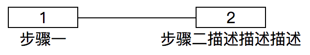
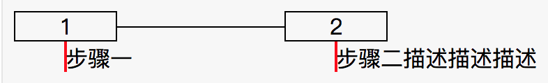
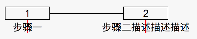
如上图所示,实现一个步骤线的布局(不止两个步骤),表示步骤的盒子长度固定不变,无论描述文字的多少,上方表示步骤的盒子必须与下方的描述文字的中心线对齐。
- 实现
1
2
3
4
5
6
7
8
9
10
11
12
13
14
| <div class="step">
<div class="step-item">
<div class="num">1</div>
<div class="desc-wrapper">
<div class="desc">步骤一</div>
</div>
</div>
<div class="step-item">
<div class="num">2</div>
<div class="desc-wrapper">
<div class="desc">步骤二描述描述描述</div>
</div>
</div>
</div>
|
将 desc-wrapper 放置在 .num div 的中心点位置,然后将 desc 向左平移文字长度的 50%;
注: 平移时需要将 desc 脱离文档流
1
2
3
4
5
6
7
8
9
10
11
12
13
14
15
16
17
18
19
20
21
22
23
24
25
26
27
28
29
30
31
32
33
34
35
36
37
| :root {
--height: 20px;
}
.step {
display: flex;
}
.num {
border: 1px solid;
height: var(--height);
text-align: center;
line-height: var(--height);
width: 72px;
}
.step-item {
position: relative;
display: flex;
flex-direction: column;
align-items: center;
}
.step-item:not(:last-child)::after {
position: absolute;
top: calc((var(--height) + 1px * 2 - 1px) / 2);
left: 100%;
content: '';
width: 120px;
height: 1px;
background: #000;
display: block;
}
.step-item:not(:last-child) {
margin-right: 120px;
}
.desc {
position: absolute;
white-space: nowrap;
transform: translateX(-50%);
}
|
使用 flex 或者 grid 布局设置 desc-wrapper 子元素居中
1
2
3
4
5
6
7
8
9
10
11
12
13
14
15
16
17
18
19
20
21
22
23
24
25
26
27
28
29
30
31
32
33
34
35
36
| :root {
--height: 20px;
}
.step {
display: flex;
}
.num {
border: 1px solid;
height: var(--height);
text-align: center;
line-height: var(--height)
}
.step-item {
width: 72px;
position: relative;
}
.step-item:not(:last-child)::after {
position: absolute;
top: calc((var(--height) + 1px * 2 - 1px) / 2);
left: 100%;
content: '';
width: 120px;
height: 1px;
background: #000;
display: block;
}
.step-item:not(:last-child) {
margin-right: 120px;
}
.desc-wrapper {
display: flex; // 或 grid
justify-content: center;
}
.desc {
white-space: nowrap;
}
|
效果